 ©DipendraShrest
Case study · Website
Kora Quest: from first click to base camp.
The challenge
Kora Quest Adventure takes people into the Himalayas, from Manang and Mustang treks to 52 days on Everest. Each trip comes with a lot of detail: permits, acclimatisation days, lodges, flights to Lukla, oxygen and gear at high camp.
The people booking are usually planning from abroad, months ahead, for a trip they have never done. Before they spend thousands on an expedition, they need to understand exactly what they’re signing up for and trust the people taking them there.
The approach
Every decision came back to the same few questions a climber asks: How high? How long? What does it cost? What’s included? Who’s taking me?
- 01Group every trip by altitude (8000m, 7000m and 6000m expeditions, plus trekking), because that’s how climbers think about them.
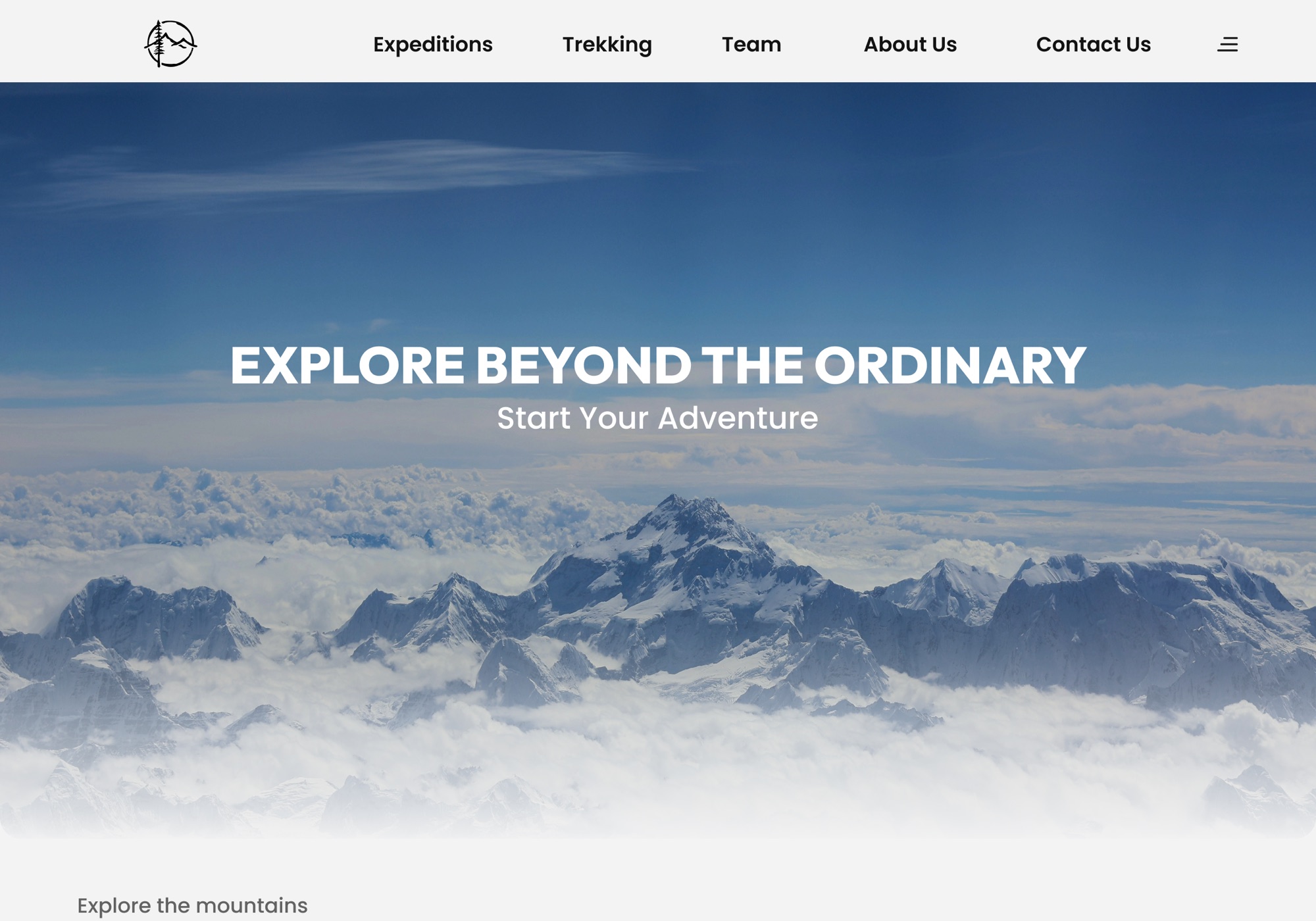
- 02Let the mountains sell the trip. Full-bleed photography up top, with a calm, quiet interface underneath.
- 03Show the key facts on every card: days, country and summit height, so people can compare without clicking in.
- 04Open every package with a fact bar: duration, difficulty, max altitude, season and group size.
- 05Keep a tab bar pinned to the package page, so a 52-day itinerary never turns into an endless scroll.
- 06Spell out what’s included and what isn’t, line by line. On a trip this size, surprises cost trust.
- 07Two clear actions everywhere: book a fixed date, or send an enquiry and talk to a person first.
Finding your mountain
The site is organised around altitude. From the Expeditions page you choose a height, 8000m, 7000m or 6000m, and land on a page made just for those peaks.
Each category page starts with a short, honest introduction to what climbing at that height means, then lists every expedition as a card. Days, country and summit height sit right on the photo, with Enquiry Now one tap away.
One page per climb
The package page is where people decide, so it had to answer everything. It opens with a fact bar covering country, duration, difficulty, max altitude, activity, season and group size. Below that are the trip highlights and the next departure dates, with Book Now and Enquiry Now side by side.
A pinned tab bar keeps the rest of the page in reach: overview, day-by-day itinerary, logistics, route map, what’s included and excluded, trip notes and add-ons. A 52-day Everest climb stays easy to follow, from arriving in Kathmandu to the summit push.
Outcomes
What I designed
- A home page that leads with the experience, then points people to the right mountain
- Category pages for 8000m, 7000m and 6000m expeditions, plus trekking
- A reusable expedition card with days, country and altitude at a glance
- A package page with dates, itinerary, route map, costs, notes and add-ons
What I learned
- On a trip this big, trust does the selling. Clear prices and real reviews do more than any banner
- Structure the content the way the audience already thinks. For climbers, that means altitude
- Long pages are fine if people can always see where they are and jump ahead
Built for
- Climbers comparing 8000m peaks and seasons
- Trekkers looking for their first Himalayan route
- International groups planning months ahead, from the other side of the world
“Nobody books Everest on a hunch. The website has to earn the trust first.”